Monday, 25 September 2017

A New Game progress

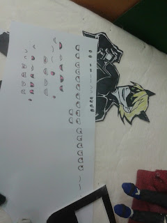
Today we finished the eye and mouth cutouts and did some animation tests using Dragonframe.


 We started off by cutting out the Lulu and Zack eye and mouth shapes and sticking them onto the clay models.

We decided to test the lip and eye syncing and claymation for the living room scene using Dragonframe.

 Here's the resulting .gif file

 Here's what it looked like to set up Dragonframe (bonus me on the side)

We also did a walk cycle test with Lulu and nearly destroyed her legs in the process. Luckily she'll only be walking at the beginning of the claymation.

Here's Lulu walking (click the gif to get it to move again).

Stop-Motion review: The Nightmare Before Christmas (1993, Henry Selick)

 Image result for the nightmare before christmas\

 The Nightmare Before Christmas is a stop-motion classic directed by Henry Selick and distributed by Buena Vista Pictures. The film follows the (mis)adventures of Jack Skellington, the Pumpkin King of  Halloweentown; who suffers from burnout after planning Halloween year after year. Jack becomes inspired again when he falls through a portal into Christmastown, where Santa Claus and his elves are busily preparing for Christmas, and decides to take over Christmas as an act of goodwill. From the beginning, Jacks friend (and love interest) Sally knows that this cannot end well. Seeing as Jack didn't consult Santa on this development and he (and the residents of Halloweentown Jack talked into helping) have no idea how Christmas works; Sally ends up being right, Jacks plan falls through and Santa ends up in the clutches of the gambling sack of bugs, Oogie Boogie.

Even though this film was released 23 years ago, it is still an enjoyable watch. Now that I am making a stop-motion project myself, I have a new appreciation for how they managed to get the lighting for some of the scenes as well as some of the wind interactions with clothes, hair etc..


Catprint progress

This week I worked on the backgrounds some more


The white areas are transparent so I can make animated backgrounds on ToonBoom

I also continued doing the frame-by-frame of the characters.

Monday, 18 September 2017

A New Game progress

Today we did more lighting tests and cleaned up our sets.

Lighting tests:


 We set up the living room set so that it would be quite dim, with the main source of illumination coming from Zack's videogame. The LED lighting was from one of the tracing boards that was in the stop-motion workshop, which had a TV mockup around it.

We had to re-learn all the camera settings, such as exposure, F-stop and Iso. Basically, Iso should be low, exposure should be less than 2 seconds and F-stop should be able to keep all the relevant detail in focus, then fiddle around with the lighting until the desired result is achieved.


The LED screen with the TV mockup around it

Zack and Lulu in a dimly lit living room. Lulu was put in front of the couch as in the beginning of the animation, she will skip around the couch and will need to be in focus at all times.


 Lulu and Zack with the lights on


Lighting tests with just the LED light


We did some pictures with some lamps for additional lighting to soften it, but the lamp had to be held at such an angle that figuring out a way to maintain it for the animation was going to be difficult.


We found a wooden frame to support the set without having to rely on the (structurally unsound) dividing wall. The camera is zoomed out a bit too far in these pictures as you can see the corners of the set.We also swapped out the LED tracing screen for the smaller, lighter Swit light


 We did some more lighting tests with the UI, mostly because we put it on a slanting table and we wanted to make sure that it would work. We have yet to achieve a good camera angle that captures all the details in the videogame UI.

Behind the scenes:

 This was when we were doing set lighting. I was fiddling with the camera settings and Marilyn was in charge of holding the TV lighting apparatus

 Us doing lighting tests on the UI


 Chloe was working on colouring in the cutouts for the UI section of the animation, and you can see some of her work here


Closeups of the pictures I drew for the photos on the livingroom wall. They also have the only representation of  the mother character (she yells a single line from the neighboring room and does not actually appear in the animation).

We also did some final paper cut-out work on the weekend:
 Eye and mouth shapes for both Lulu and Zack for the living room scenes (we plan on having their lip-synching similar to that in Robot Chicken)

 An example of the final cutout of the videogame character

 An example of some of the clothing options

 the clothing options with one option selected

Stop-motion review:


Chase me (2014) Gilles Deschaud

Image result for gilles deschaud chase me
 Chase Me is the multiple award-winning stop-motion film directed by Gilles Deschaud, made entirely using 3D printing. Chase Me is about the journey of a girl playing the ukelele, whilst being chased by a nebulous monster through a colourless forest. The music in this show was enjoyable, catchy and the animation timed well with it. While some of the stop-motion was a little jittery, this short was well shot and had excellent movement, lighting and use of colour throughout.

catprint progress


For some of the more complex and fluid motions made by the cat, frame-by-frame is needed, so that is what I focused on this week


frame by frame of the cat licking itself.


Here's the roughs of the cat jumping onto a desk and placing something down


Tuesday, 12 September 2017

Animation history 1980-1985

Animation history 1980-1985

Canada

 Gerald Potterton:

Created Heavy Metal (1981), which was an adaptation of an adult comic book. The film contained many psychedelic sci-fi themes that became iconic for the time period. Many of the human characters were rotoscoped.

Richard Condie

created The Big Snit (1985), which featured simple drawings, wobbly lines and a refusal to take things seriously.

Nelvana Studio:

Created Rock and Rule (1983), which had many similar themes to Heavy Metal (mostly the heavy emphasis on music and psychedelia) and was set in a post-apocalyptic world ruled by mutant animals

France

Paul Grimault:

Formed a small animation company with Andre Sarrut, where the The Shepherdess and the Chimneysweep started being made in 1948. When Grimault and Sarrut had a falling out, the film's production was halted, only starting up again when Grimault finally won the rights to the film in 1967. The film was retitled The King and the Mockingbird and finished in 1980 (32 years after production first started)

UK

 Dianne Jackson

Image result for the snowman 1982
 Created The Snowman in 1982, which was nominated for the 1983 Academy Award for best animated short film. The film seems to be traditionally animated using crayon, which still looks good to this day

Cosgrove Hall Productions 

Created The Wind in the Willows (1983), a stop-motion film detailing the lives of various animals in a fictional English location. It's success led to 52 episodes in a TV series and a second film A Tale of Two Toads (1989)

Gerald Scarfe

Created 15 minutes of animation for Pink Floyds The Wall (1982).

UK/USA

 John Halas

Created the short Dilemma (1981), following his work on Autoban (1979), and claims to be the first fully digitised CG film, although it is unclear how much was cel animation made to look like CG and how much was actually CG.

Canada/Germany

 Frederick Back

Made Crac! (1981) the story from the perception of a families' rocking chair, which was an early example of the pastel shaded look that became popular in the 1980s

Czech Republic

 Jan Svankmajer

created Dimensions of Dialogue (1982) and Alice (1988), which often incorporate stop-motion in the most horrifying way possible

UK/Canada

Steve Baron

Image result for take on me
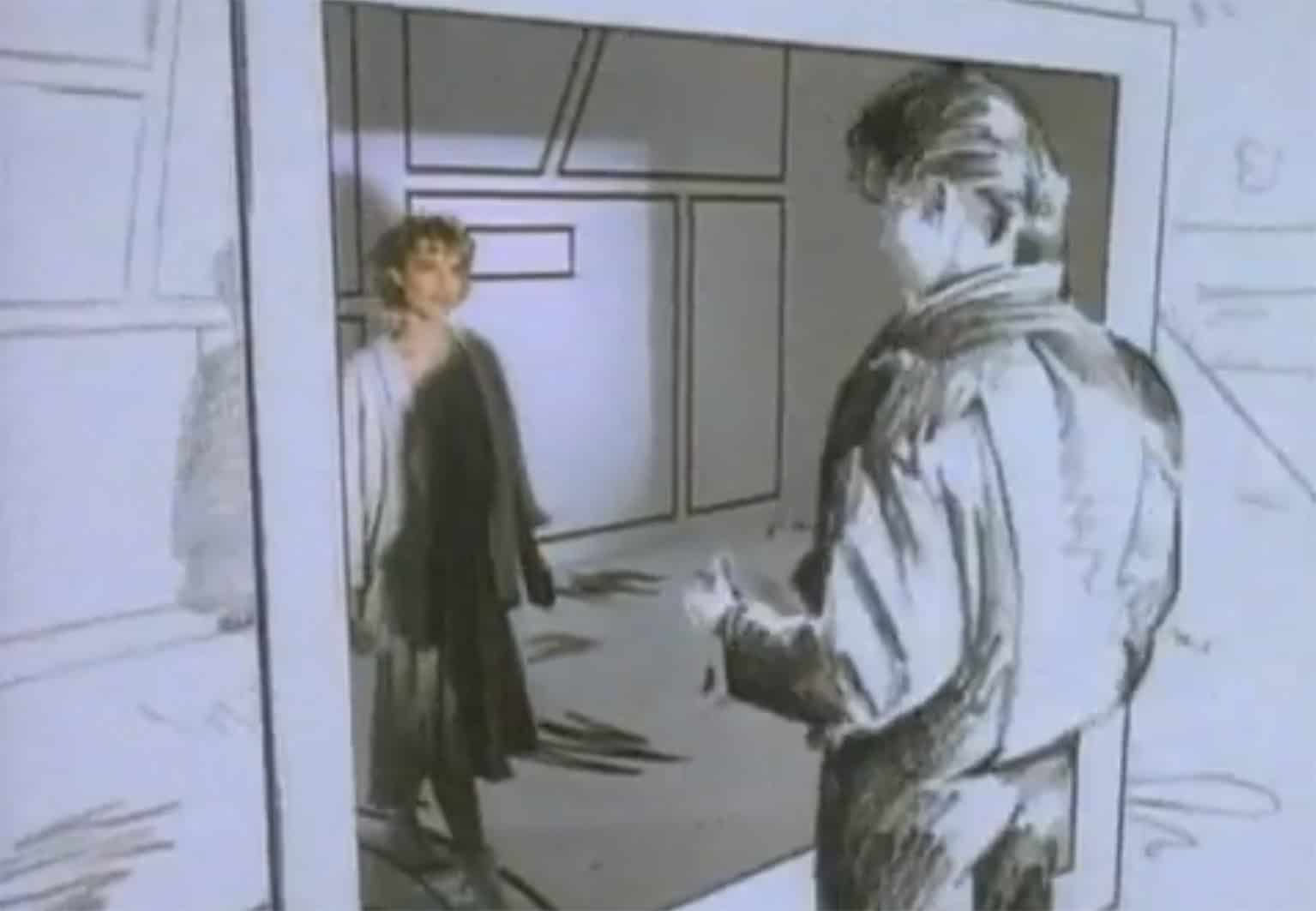
Made music videos Money for Nothing (1985), which featured some primitive CGI animation, and A-Ha's Take On Me (1985), which features rotoscoped human characters animated in such a way that still holds up to this day.

Hollywood Blockbuster

The 1980's introduced High Concept films, which featured elements such as easily categorised characters, familiar simple plots, stylish and slick production qualities, aimed for broad mass appeal and a strong marketing team, which were responsible for film, video, TV and fast food promotions.

This period also popularised the clearly defined film genres (action, horror, fantasy etc.) as well as endless sequels

Monday, 11 September 2017

A New Game progress

Today we handled lighting and adding plasticine to the character models
 Today we learned that shadows in lighting can be softened by the addition of diffusers, which diffuse the light over a larger area and reflections can be removed by angling the light source in such a way the camera doesn't catch it.

A good resource is Light Science and Magic (3rd or 4th Edition), at around page 194

Plasticine models:

Marilyn and I worked on plasticine models, while Chloe refined the cutouts of the UI section


 a nearly complete Lulu

Chloe marveling at all the work she's done today

 videogame UI with the perspex sheet
videogame UI

camera setup for the lighting test

 Completed Lulu and Zack. I may add a tutu onto lulu later

 A goofy (terrible) gif of a partially complete Lulu giving the ol' razzle dazzle (the final animation will look waaay better than this)

 Zack's completed model


Lighting tests:

We also had a camera and tripod in the class so I decided to test the perspex sheet we ordered to see how it would reflect

 We forgot to check the iso of the camera, so the image was really dim, even when the room lights were on

Here's the image, with the paper cutouts sitting on top of the perspex sheet, which reflects the fluorescent lights overhead

Here's the image with the main lights turned off, lit by a single lamp with a diffuser taped onto it to soften the shadows. The perspex sheet does not reflect the lights (yay!), now we have to fix the camera angle and brightness of this shot.

 These images were just me testing with the light angle, the presence and absence of the reflector etc.

The images were quite dim, which can be remedied by fiddling with the camera settings (aperture size, exposure duration etc.) or by adding another lamp.

Here's a(n edited) pic of me doing the lighting tests that I didn't notice was being taken


Stop-mo review (lighting edition)

The Sea Is Blue (2015) by Vincent Peone


The Sea Is Blue is a stop-motion short detailing the story of how the ocean became blue. The short begins with a fisherman and a little girl named Bean, who were fishing and playing with toys respectively. Whilst playing, Bean falls from the boat and sinks to the bottom of the ocean, where she meets and plays with various deep sea fish. Upon noticing her disappearance, the fisherman had stopped his boat and set down the anchor to rescue her. Upon realising she has to leave, Bean says goodbye to her new friends and swims to the surface. As she swims to the surface, the previously green ocean turns blue around her.

I found this film to be a short, but sweet watch and beautifully animated too. I enjoyed the underwater bits due to their dream-like quality and good use of colour (the soft, dappled greens were pleasing to my eyes). I also enjoyed that Bean ends up befriending some of the more "scary" fish such as the angler fish and something which looks similar to a Sloane's viperfish.

Vincent Peone says in an interview (found here: https://www.youtube.com/watch?v=MSHTdEFsBjc&list=PLo_ncjWJvq-gJqGQaQERz93_4YA139e62) that the film was dedicated to his sister, who was in a coma at the time; for which the surrealist underwater scenes act as a metaphor. The puppets were made from clay over a wire armature, and the faces were CG animated in post. Bean's hair in particular was made from goat hair over wires to obtain the movement in the strands as seen in the windy/underwater scenes.


Behind the scenes shot from the director interview video. You can see that to achieve the underwater effect, they had a perspex/glass sheet with the water effects on top and the light above being filtered through by a diffuser. The soft greenish tint for the underwater scenes was probably added in post-production