Lighting tests:
 We set up the living room set so that it would be quite dim, with the main source of illumination coming from Zack's videogame. The LED lighting was from one of the tracing boards that was in the stop-motion workshop, which had a TV mockup around it.
We had to re-learn all the camera settings, such as exposure, F-stop and Iso. Basically, Iso should be low, exposure should be less than 2 seconds and F-stop should be able to keep all the relevant detail in focus, then fiddle around with the lighting until the desired result is achieved.
The LED screen with the TV mockup around it
Zack and Lulu in a dimly lit living room. Lulu was put in front of the couch as in the beginning of the animation, she will skip around the couch and will need to be in focus at all times.
Lulu and Zack with the lights on
Lighting tests with just the LED light
We did some pictures with some lamps for additional lighting to soften it, but the lamp had to be held at such an angle that figuring out a way to maintain it for the animation was going to be difficult.
We found a wooden frame to support the set without having to rely on the (structurally unsound) dividing wall. The camera is zoomed out a bit too far in these pictures as you can see the corners of the set.We also swapped out the LED tracing screen for the smaller, lighter Swit light
We did some more lighting tests with the UI, mostly because we put it on a slanting table and we wanted to make sure that it would work. We have yet to achieve a good camera angle that captures all the details in the videogame UI.
Behind the scenes:
This was when we were doing set lighting. I was fiddling with the camera settings and Marilyn was in charge of holding the TV lighting apparatusUs doing lighting tests on the UI
Chloe was working on colouring in the cutouts for the UI section of the animation, and you can see some of her work here
Closeups of the pictures I drew for the photos on the livingroom wall. They also have the only representation of the mother character (she yells a single line from the neighboring room and does not actually appear in the animation).
We also did some final paper cut-out work on the weekend:
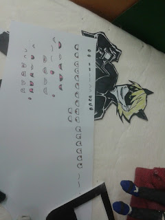
Eye and mouth shapes for both Lulu and Zack for the living room scenes (we plan on having their lip-synching similar to that in Robot Chicken)
An example of the final cutout of the videogame character
An example of some of the clothing options
the clothing options with one option selected


No comments:
Post a Comment