Today in class, we delivered our pitches. We also learned about writerduet.com, which can be used for writing and formatting screenplays.
For our animation, We continued working on character concepts and the aesthetic of the video game UI. Each member of our group has split up to do different aspects of the animation concept, with me on the older brother character and the younger sister design choices, Chloe on younger sister and older brother design choices, and Marilyn on the video game character base and the video game UI.
This is an example of the kind of design choices the younger sister would make on top of the male character template provided by Marilyn.
When both siblings are arguing over the character's appearance, the end result is something like this. Base template is done by Marilyn, pink contributions are done by me (younger sister), dark red contributions are done by Clhoe (older brother). Red annotations are Chloe and I discussing what elements work together for the final character appearance.
Text reads (top to bottom):
Dress underneath jacket
girl hair [choice] with guy colours
unicorn horn
SPARKLES
I also sent the photoshop template to Chloe to add some of the older brother design choices onto the video game character. For the final character appearance at the end of the animation, a combination of design choices from both Chloe and I will be incorporated onto the same character.
This is the concepts for the Background of the videogame user interface that Marilyn designed. We plan to use a layered approach so we can move different elements without them interfering with each other.
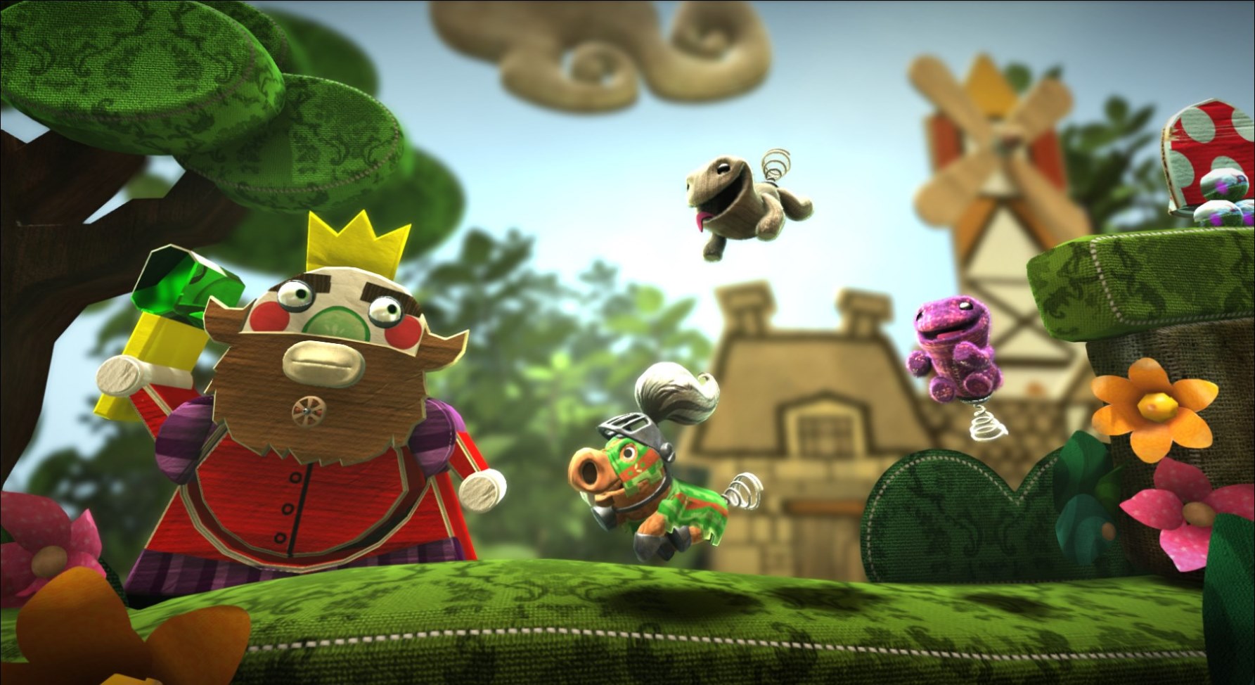
The aesthetic of the videogame UI may be similar to that of Little Big Planet:

In the future we have to sort out the treatment, logline, screenplay and script before we can start storyboarding and animatics as our story is very dialogue driven.


No comments:
Post a Comment